Blue has long been a favourite in interior design thanks to its association with calm, clarity, and timeless style. From powdery pastels to inky navies, it’s a colour with serious range. But while blue can be beautifully grounding, it can also feel cold, heavy, or overwhelming when overused.
The good news? Blue doesn’t need to dominate a room to make an impact. With the right balance, thoughtful placement, and supportive textures, it can elevate a space without stealing the spotlight.
What Does Decorating With Blue Really Mean?
Using blue in interiors isn’t just about painting walls navy or choosing bold statement furniture. It’s about understanding tone, depth, and how blue interacts with light and materials.
Lighter blues often feel airy and relaxed, making them ideal for everyday spaces. Deeper blues carry more visual weight and work best when used selectively. Blue can be warm or cool, depending on undertones, and it can feel classic, coastal, modern, or moody based on how it’s styled.
The key is intention. Blue works best when it’s part of a wider palette rather than the whole story.
Why Blue Continut Colour
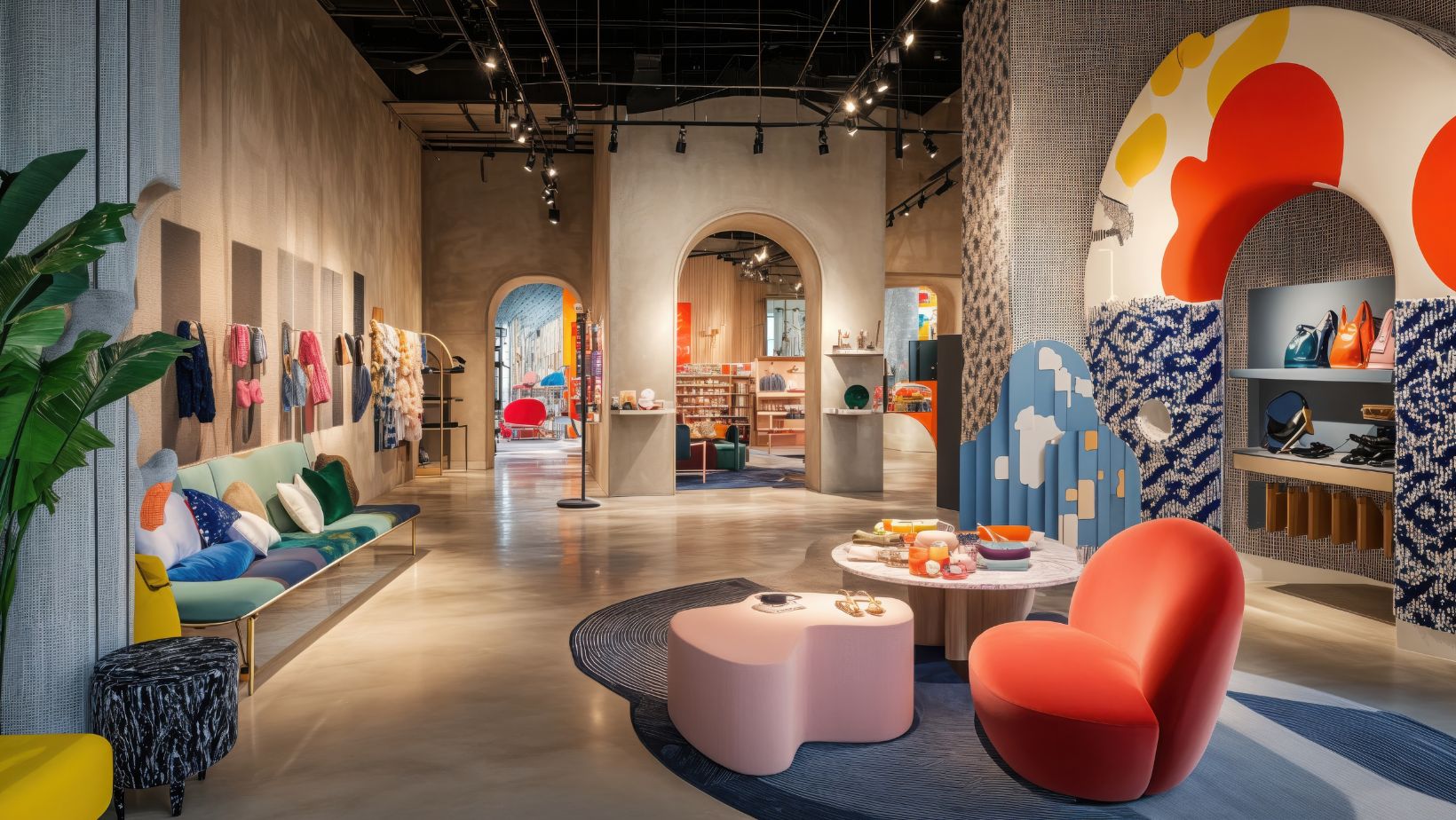
If committing to blue feels risky, accents are the safest place to begin. Cushions, throws, artwork, and ceramics allow blue to add personality without overwhelming the room.
Soft furnishings in blue work particularly well against neutral backdrops. A cream sofa with muted blue cushions, or a warm beige room with a blue-toned rug, introduces colour in a way that feels layered and intentional.
Even practical items like lampshades or upholstered stools can introduce blue subtly, especially in smaller spaces where wall colour might feel too dominant.
Balance Blue With Warm Materials
One of the most common mistakes with blue interiors is forgetting warmth. Blue on its own can feel flat or chilly, particularly in north-facing rooms.
Natural materials help counterbalance this. Wood finishes, woven textures, and tactile fabrics soften blue’s coolness and make it more inviting. Flooring plays a big role here. Warm-toned engineered wood, natural oak, or even softly textured vinyl flooring can ground blue elements and stop a space from feeling stark.
Pairing blue cabinetry or walls with wood floors instantly creates contrast and depth, helping the colour feel considered rather than clinical.
Choose the Right Shade for the Right Space
Not all blues suit every room. The function of the space should guide the shade.
- Living rooms benefit from softer blues that feel relaxed and sociable.
- Bedrooms suit muted, dusty blues that encourage rest without darkening the space.
- Kitchens can handle stronger blues, especially when balanced with light worktops or warm flooring.
- Bathrooms work well with blue, but lighter shades prevent the space from feeling cold.
Testing samples in different lighting is essential. Blue can shift dramatically throughout the day, appearing warmer or cooler depending on natural and artificial light.
Let Blue Support, Not Dominate
Blue doesn’t always need to be the star of the room. Sometimes it works best as a supporting colour, enhancing other elements rather than leading the design.
Using blue on lower walls, cabinetry, or built-in furniture keeps it visually grounded. Alternatively, blue can appear in a pattern rather than a block colour; think subtle stripes, marbling, or mixed textiles.
When blue is allowed to sit alongside neutrals, rather than compete with them, it feels calmer and more timeless.
Is Decorating With Blue Worth It?
For those drawn to calm, balanced interiors, blue is absolutely worth considering. It offers colour without chaos and character without excess. The trick lies in restraint and thoughtful pairing.
Blue works best when supported by warmth, texture, and natural materials. Used carefully, it enhances a home rather than overpowering it, creating spaces that feel both stylish and lived-in.